SOCIAL | UX DESIGN | CAMPAIGN
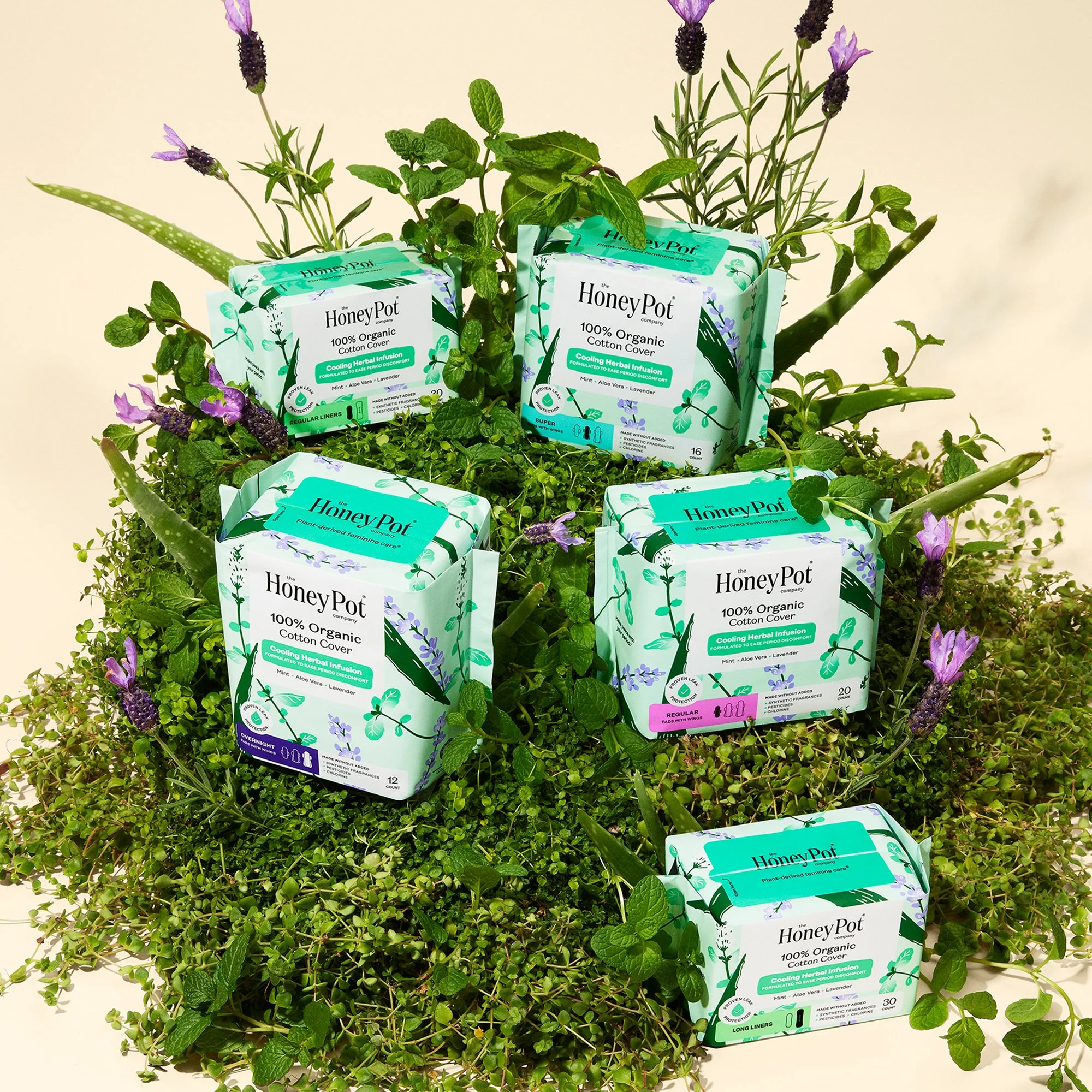
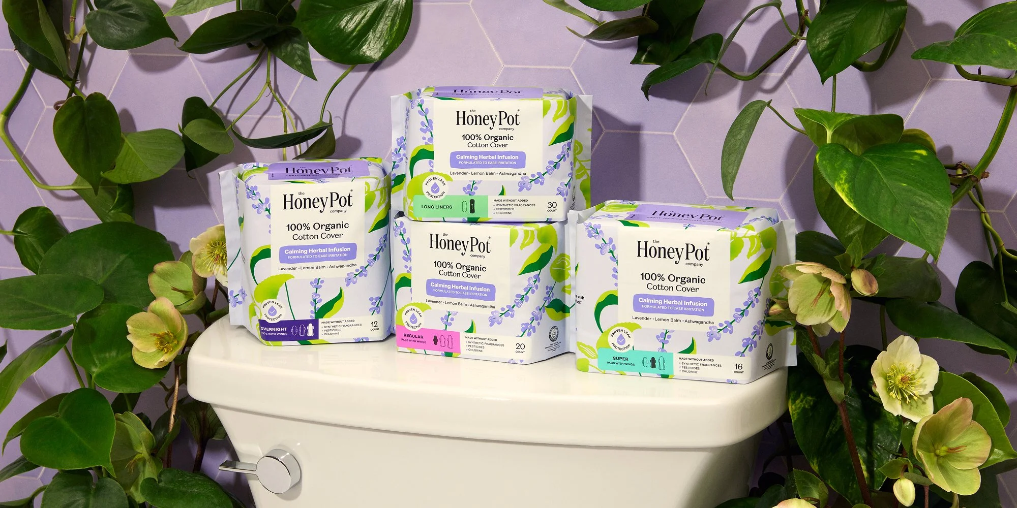
The Honey Pot
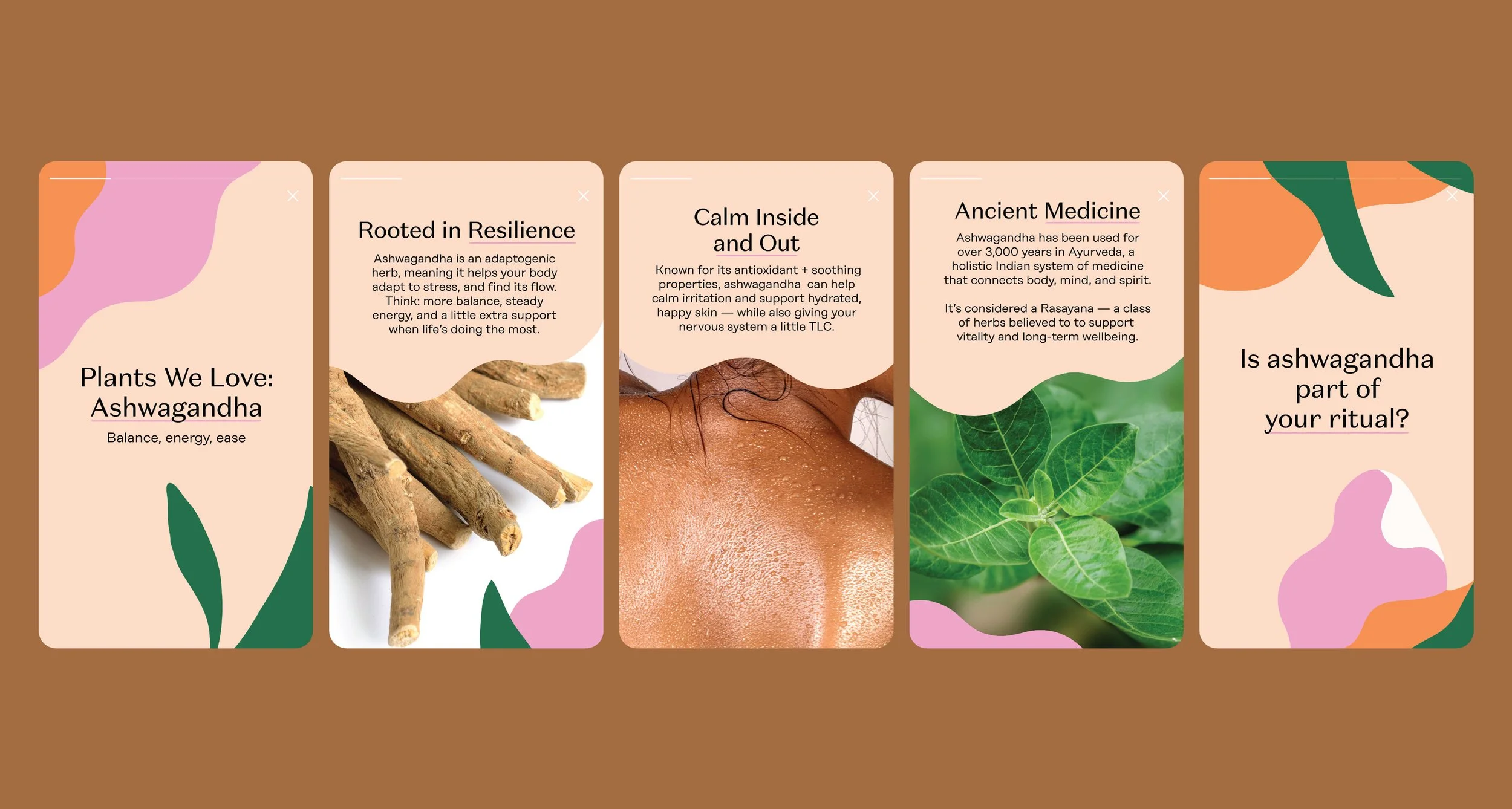
At The Honey Pot, we believe women deserve to live with confidence and are worthy of a wellness routine that nurtures body, mind, spirit, and vagina. We recognize this is not always how women experience their lives. And this is why we strive to create a safe space for education that empowers women to make the best choices for their personal and vaginal wellness. All of our products are designed with this intention in our hearts, with formulas inspired and informed by the power of herbs and ancient medicine, to support women at every stage and every age.